


Project Type: Personal
Role: UX/UI Designer
Tool: Figma
In this case study, I will showcase the design process and user experience considerations that went into creating an order tracking mobile app for an organic fish food brand. This project was undertaken as part of the Google UX Design course, where the goal was to develop a compelling user experience solution for order tracking. Although this case study is not based on an actual project, it demonstrates how the mobile app was designed to provide a seamless and intuitive experience, enabling users to effortlessly track their orders and receive real-time updates.
In the Google UX Design course, I was tasked with designing a mobile app for an organic fish food brand, aimed at simplifying the order tracking process. The goal was to overcome common challenges in order tracking by creating an intuitive and seamless user experience, enabling real-time updates for customers.
Develop a user-friendly mobile app for order tracking, focusing on intuitive navigation, tailored specifically for an organic fish food brand.
Enhance the overall customer experience by providing real-time updates on order status, increasing transparency and customer satisfaction.
Streamline the order tracking process to simplify user interactions and reduce the need for customer support inquiries, thus improving operational efficiency.
For the start of my research in this solo project, I conducted a competitive audit, providing a comparative analysis with existing apps to identify improvement opportunities for the order tracking app.


From the audit findings, I identified key pain points that this conceptual app could address, emphasizing areas for potential user experience enhancement in a real-world scenario:
Lack of transparency: Users expressed frustration with the limited visibility into the status and progress of their orders during our research. This emphasizes the need for a more transparent and informative tracking system.
Complex tracking process: The existing order tracking processes on various platforms were found to be confusing and disjointed by users, highlighting the importance of a streamlined and user-friendly solution.
Communication challenges: Users had difficulties with receiving clear and timely order updates, leading to feelings of uncertainty and dissatisfaction.
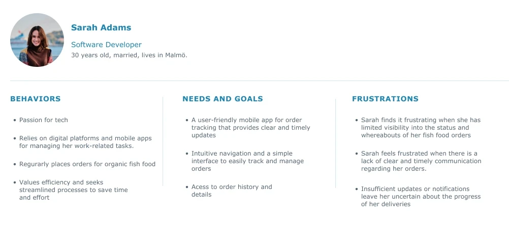
User Persona
Starting with my design process, I developed a user persona that captures the behavioural patterns, needs, and frustrations of a target user.
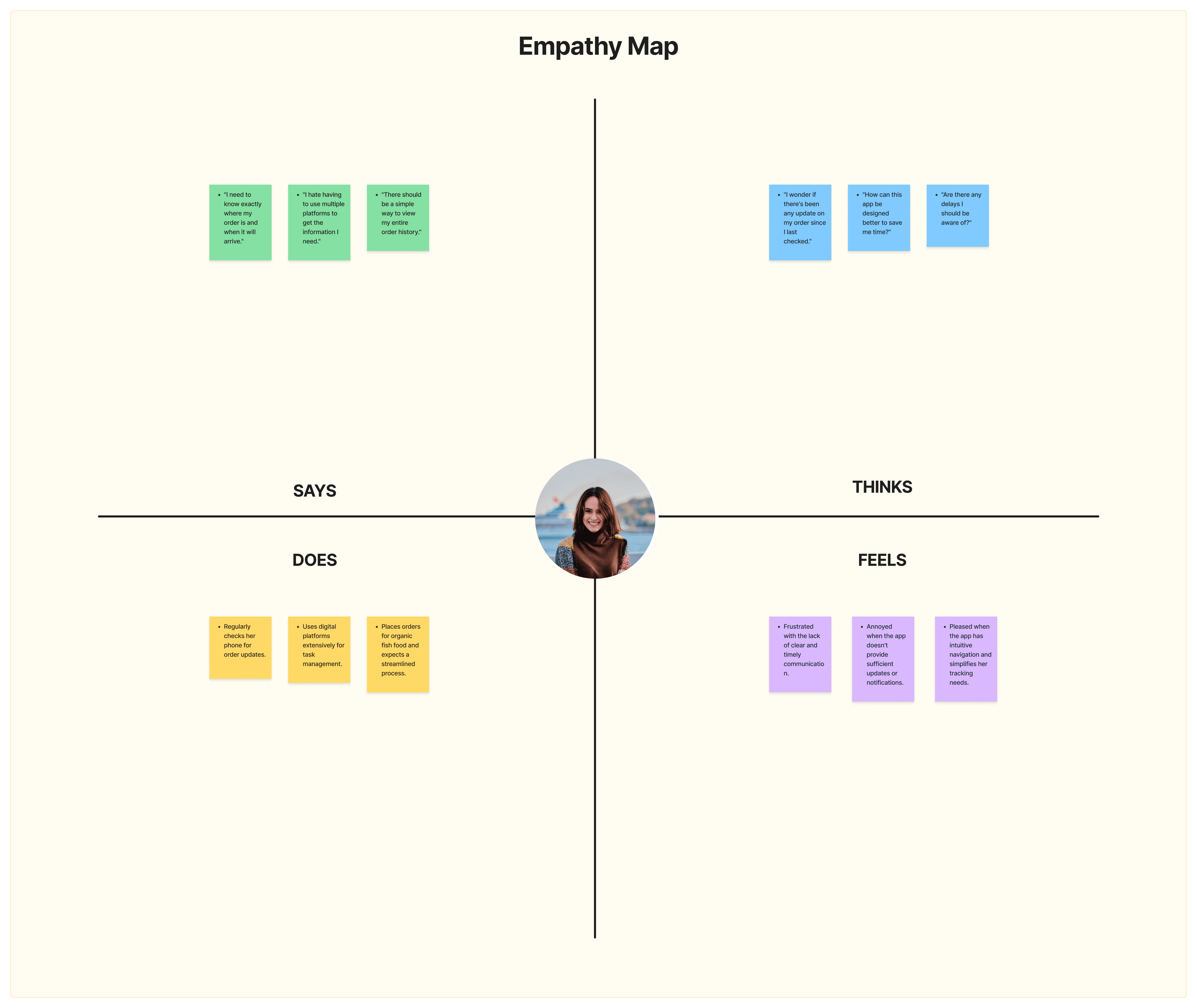
Empathy Map
The empathy map visually represents Sarah's experiences, including what she says, does, thinks, and feels, providing insight into her interaction with the order tracking app.
User Journey Map
The user journey map outlines Sarah's interactions with the app from placing an order to receiving it, pinpointing improvement opportunities to enhance her experience.

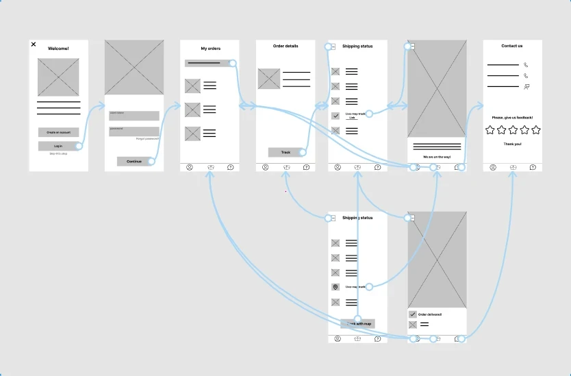
Low-Fidelity Prototype
Following the insights from user journey map, I developed wireframes and low-fidelity prototype to visualize the app's general structure and navigation.
After testing the low-fidelity prototype, I gathered key feedbacks that highlighted areas for simplifying and improving the app's design: FEEDBACK IS BOLD
Those findings were:
1
User wants to have a contact / help page.
2
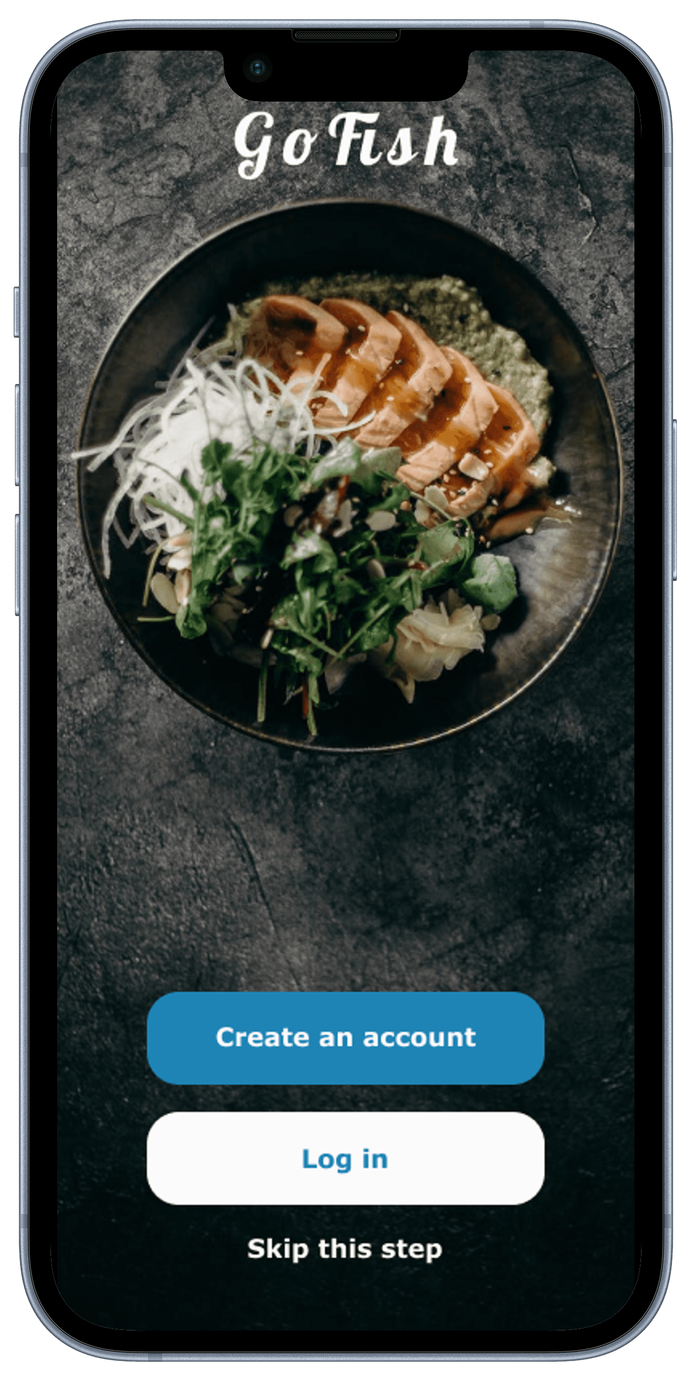
User wants to be able to use the app without creating an account.
3
All orders need to be divided into ongoing and completes orders.
4
In order details page, user wants to see status of an order before tracking it.
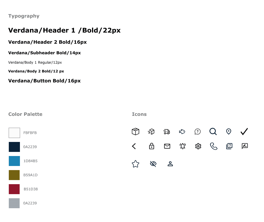
High-Fidelity Prototype
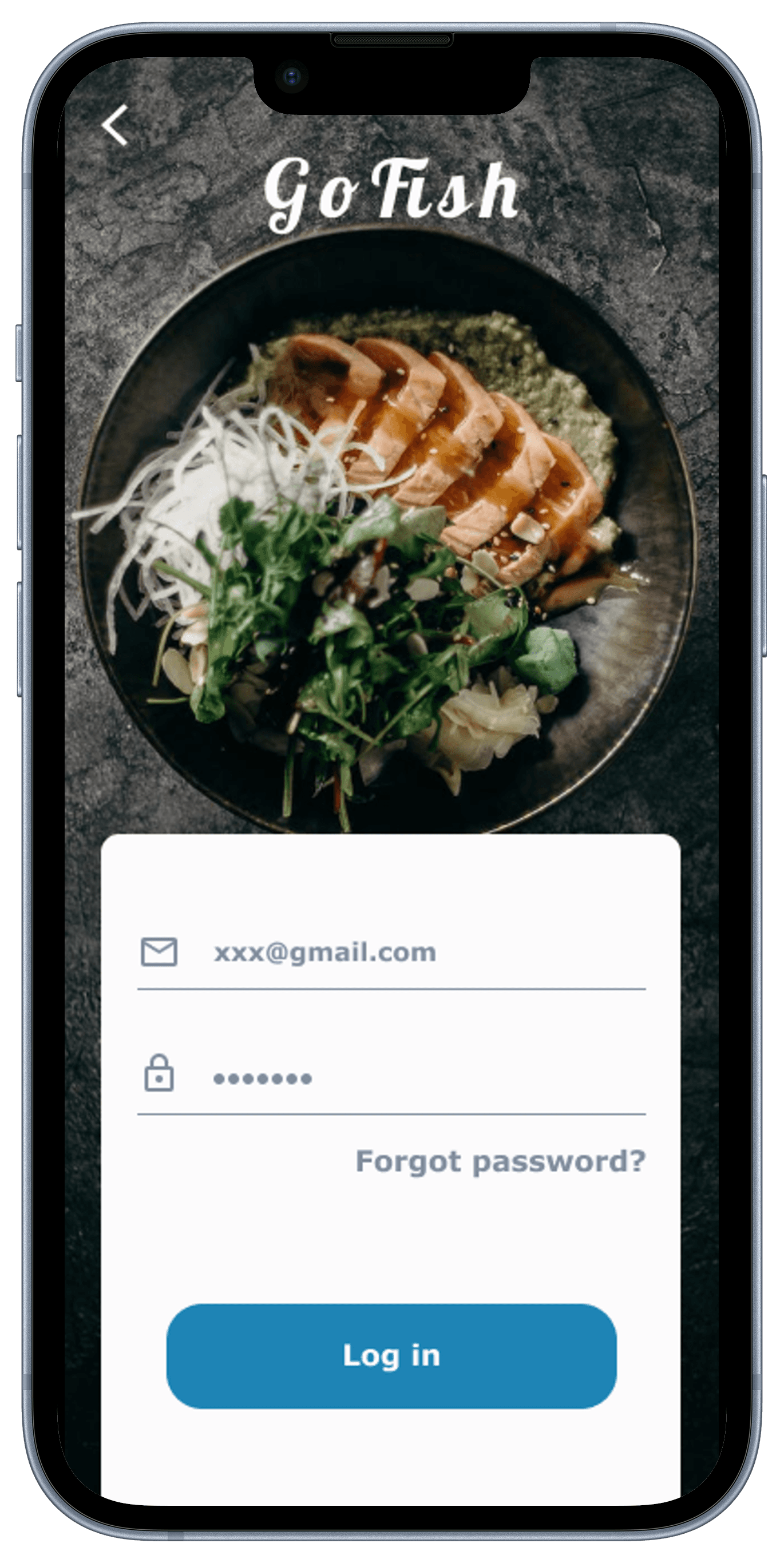
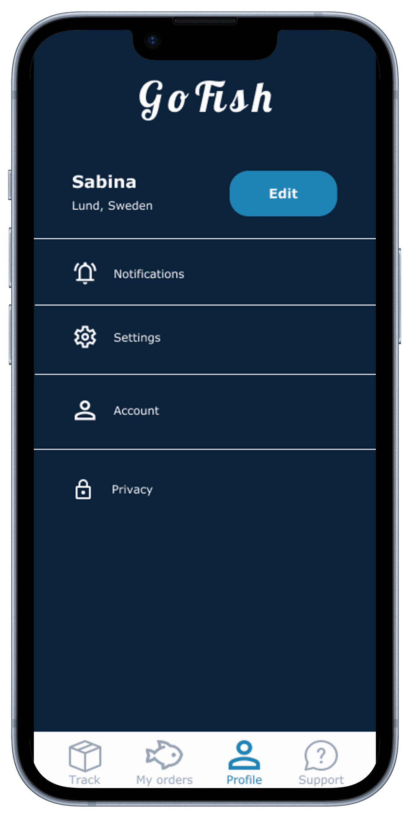
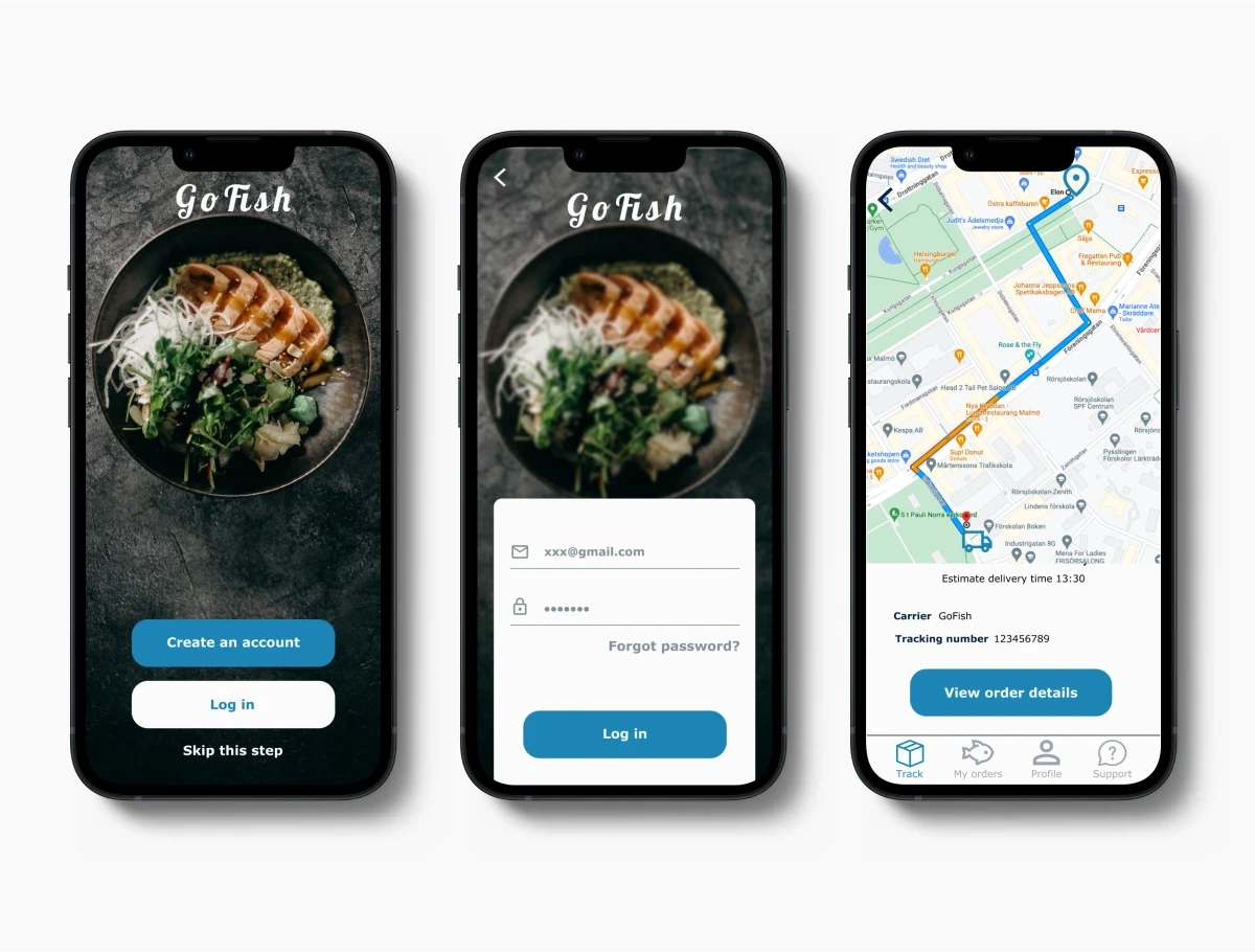
Guided by user feedback on the low-fidelity prototype, I created a high-fidelity prototype with an updated UI for the order tracking app.
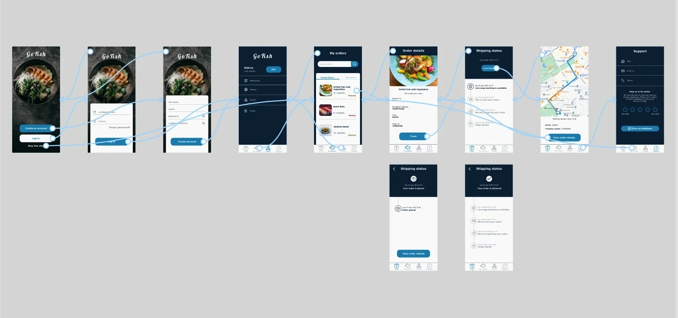
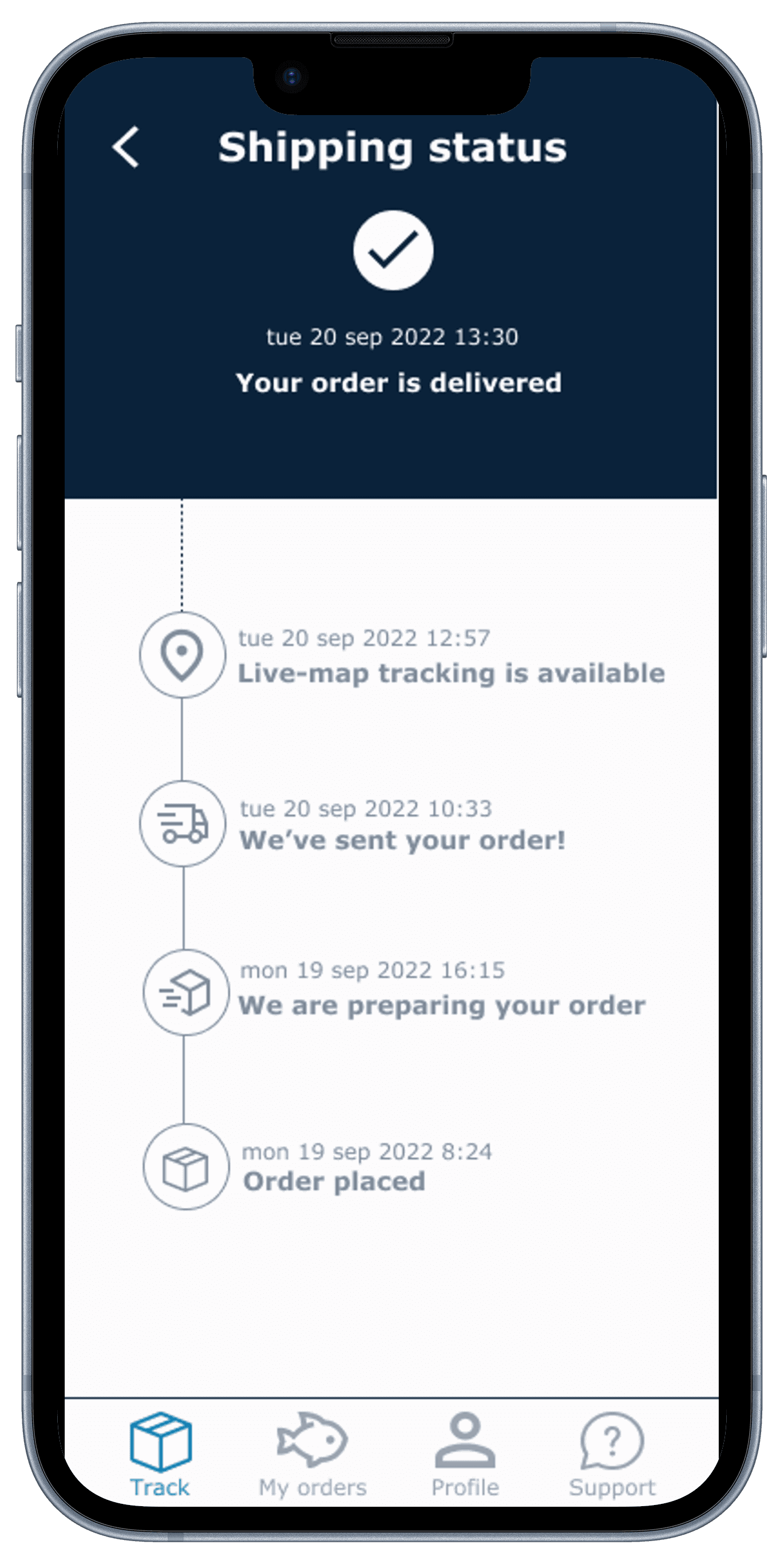
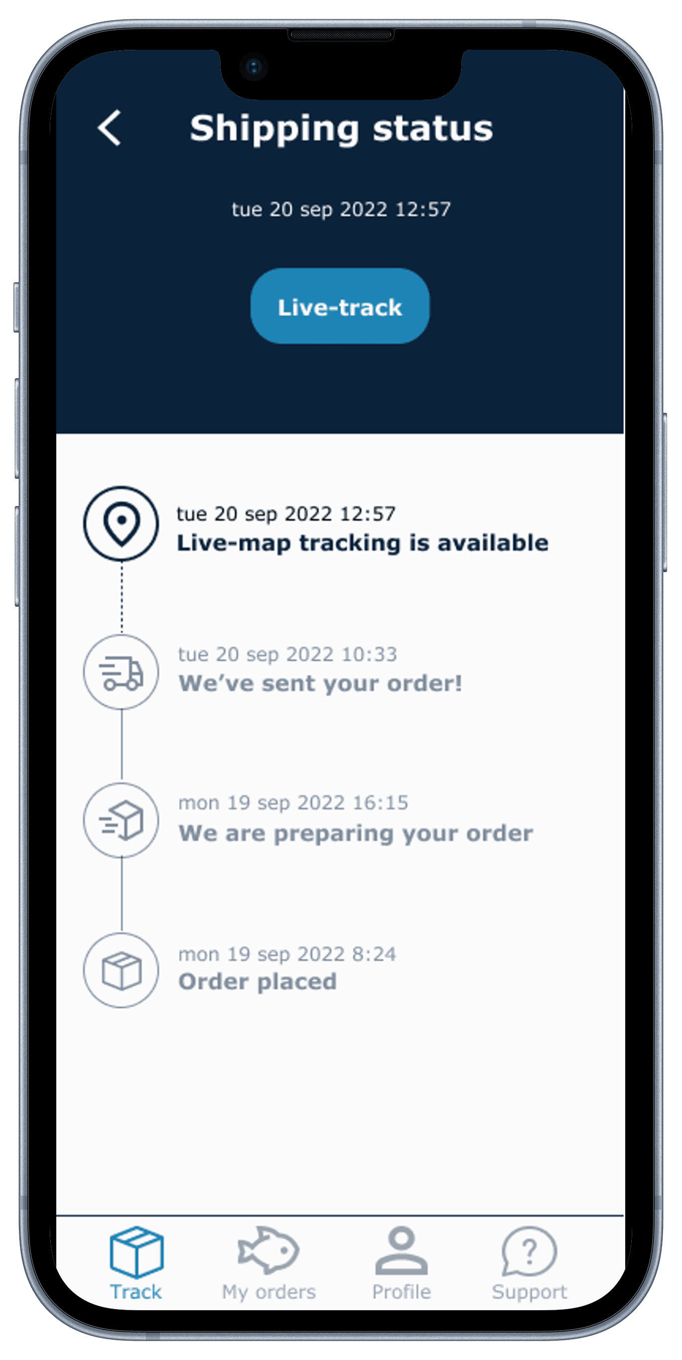
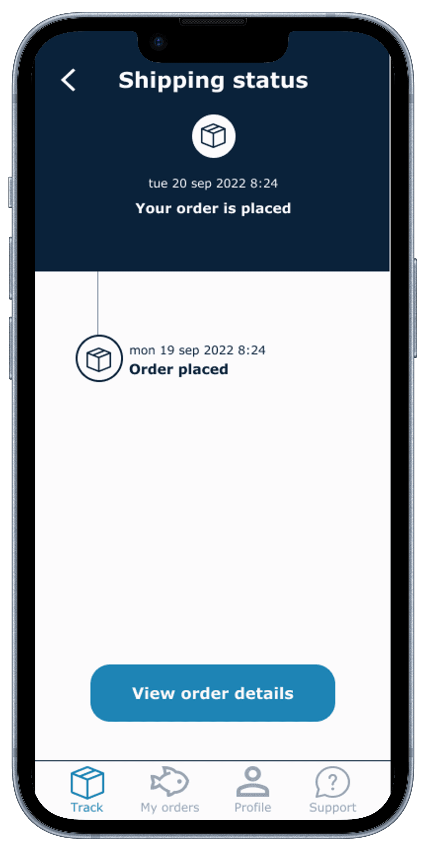
The "shipping status" screen provides users with detailed, step-by-step updates, including a live-map feature, ensuring they are informed about their order's progress in real-time.
The "my orders" screen offers a clear and organized overview of a user's current and past orders, complete with visual previews and status indicators for easy tracking.
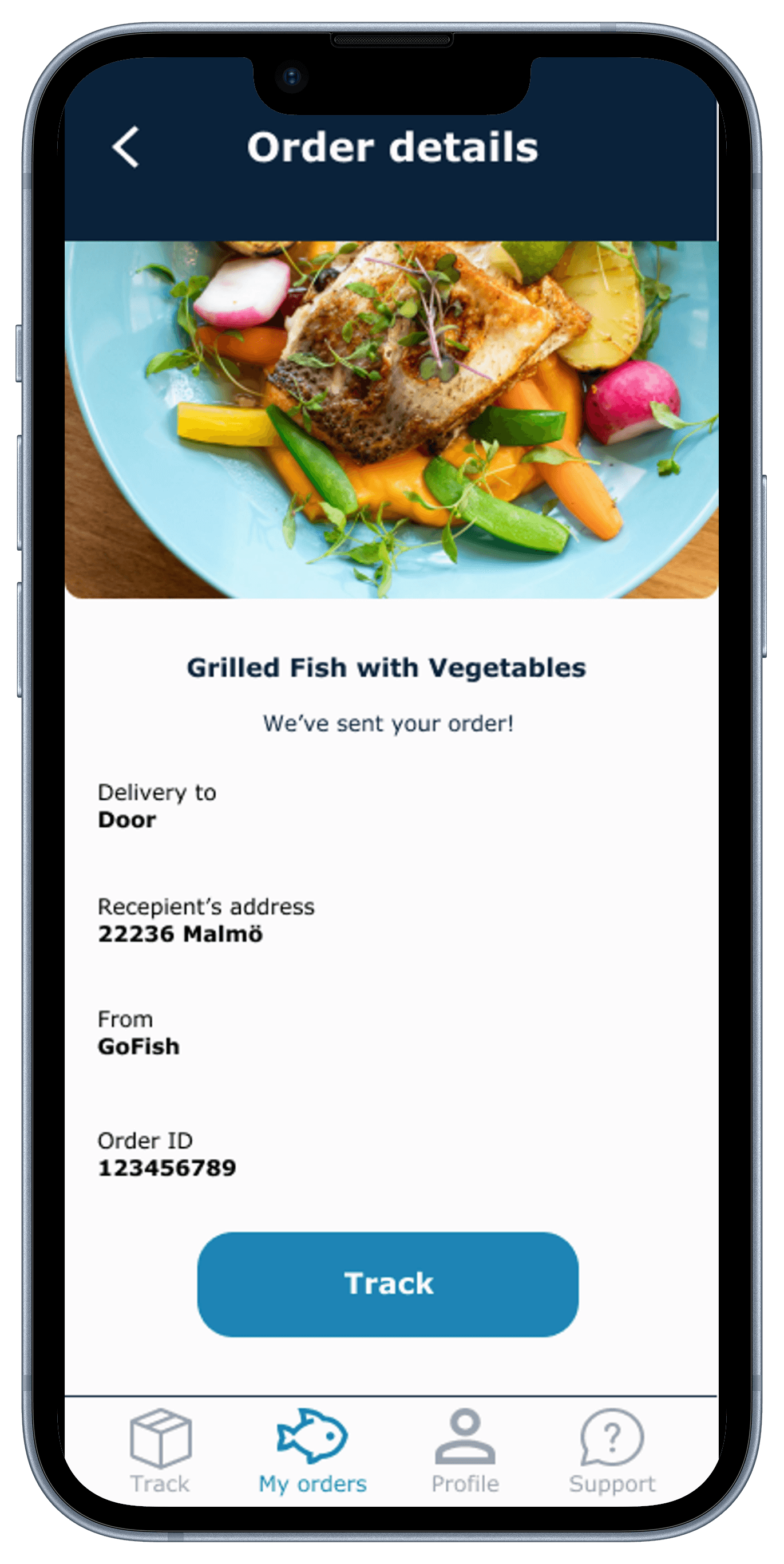
The "order details" screen provides a clear summary of the order, including a vivid image of the item, delivery details, and a tracking option for user convenience.
The "support screen" offers straightforward access to help resources and a feedback system to enhance the service based on user ratings and comments.
Through my first design project, I gained a solid understanding of principles and processes of UX design. I learned about user research, wireframing, prototyping, as well as to empathize with users, identify their needs and align design decisions with their expectations. Working on this individual project has been a valuable learning experience that has provided me with fundamental knowledge of the field.
© Sabina. 2023